
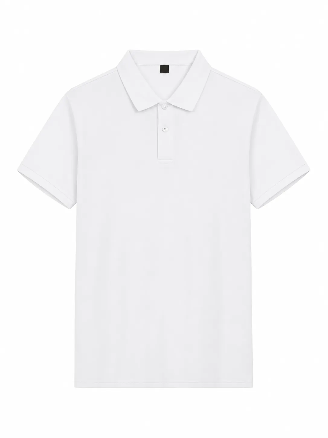
A logo can look clear on a white document and become difficult to read on a colored polo. A garment introduces a new background, textured surface and different viewing distance. For teamwear, the task is not simply choosing attractive colors. It is creating a readable result connected to the organization’s identity across the selected garments, decoration positions and sizes.
This guide explains how to plan that decision before approving embroidery or printing. It uses visual checks rather than promising an exact result from a screen. Fabric, artwork size and decoration method need to be reviewed together. Final colors and production details should be confirmed for the particular order, with approved references kept in one accessible record.
Start with approved brand artwork
Ask the brand owner for current logo files and rules about approved color versions. A brand may have a primary version and alternatives for contrasting backgrounds. Do not create an unapproved recolored logo simply because it appears easier to reproduce. Establish what may change and who can approve it before preparing variations for the supplier.
Keep the original file intact and name working versions clearly. If the team provides a revised file, record which version it replaces. A version log prevents conflicting artwork arriving through different contacts. It also allows the buyer to explain exactly what was accepted if a question appears during sampling, production preparation or a future reorder.
Treat the garment as the background
Look at the proposed garment color rather than an approximate square on a slide. Navy, black and deep green are different backgrounds even when they all seem dark. Small contrast changes can affect how clearly a logo’s edges appear from a normal distance. Review the whole mark, including small lettering and any outline around it.
For light garments, check whether pale brand colors disappear against the fabric. For dark garments, assess whether dark outlines become difficult to distinguish. The aim is to understand the artwork’s relationship with the garment, not impose one universal color rule. Keep the selected color names attached to the proof so nobody evaluates the wrong background.
Review the artwork at its intended size
A large monitor image can conceal problems appearing when artwork is reduced to a chest logo. Display or print the design at the proposed dimensions and review the smallest text. Confirm whether the decoration method can reproduce those details on the selected material. Color cannot compensate for lettering too small to work clearly.
Evaluate the result from the distance at which it will normally be seen. A visitor speaking with an employee encounters the uniform differently from someone examining a close-up photograph. Ask reviewers to assess important features at a realistic scale. Keep a magnified view for detail review, but do not use it as the only basis for approving readability.
Compare full-color and simplified versions
Where guidelines permit, compare the main logo with an approved simplified version. Fewer colors can make some designs easier to understand at small sizes, but simplification should preserve identity. Ask which features are essential and which official variants are available. Do not remove meaningful elements without the brand owner’s agreement or approval.
A one-color version is not automatically less expensive or more suitable. Quotation depends on the actual process, dimensions, quantity and other requirements. Treat simplified artwork as a visual option needing its own feasibility and price confirmation. Record which garment colors use it instead of leaving the production team to choose an interpretation independently.
Include collar and cuff colors
Tipping and contrasting cuffs introduce additional colors around the logo. A design working on a plain polo may feel busy beside strong trim. Review the upper chest, collar and sleeves together. Consider whether the garment already provides enough emphasis or whether the artwork needs a quieter supporting role. A coordinated result often comes from deliberate relationships rather than extra decoration.
A trim can connect a uniform range without supplying a matching decoration reference. Compare actual materials where that relationship matters. Record garment color, trim description and logo colors separately. A general instruction such as matching blue should not carry several meanings, particularly when the buyer expects the same visual identity across polos and outerwear.
Understand digital mockup limitations
A mockup helps discuss layout and overall contrast. It does not guarantee dyed fabric, embroidery thread or printed color. Screens, image compression and lighting can change the result. Explain which decisions the preview supports and which remain subject to a physical reference or further confirmation. This keeps a useful visualization from becoming an unintended promise.
Review spelling, proportions, placement and color descriptions on a supplier’s proof. If a color seems wrong, identify the reference to use. Avoid approving a proof with an instruction to make it closer later. Resolve comments before treating the approval as final, or clearly document the agreed step for reviewing the outstanding change.
Discuss embroidery using appropriate references
Embroidery introduces thread as the visible material. Its surface and stitch direction can affect appearance under light. Ask what references are available and how brand colors will be interpreted. A digital value alone does not establish that an identical thread shade exists. Discuss the practical options rather than assuming a direct conversion from the artwork.
Review small text, outlines and filled areas on textured fabric. If an appearance sample is requested, identify its garment and artwork version. Keep photographs and written references while recognizing their purpose. Where a physical sample has been approved, a photo supports communication rather than automatically replacing the reference governing the agreed decoration result.
Discuss printing for the selected fabric
Printing should be evaluated for the actual material and garment color. Ask about the proposed approach where necessary, including limitations affecting fine details or the result on a dark background. Do not infer the process from a general phrase such as custom printing. Confirm what method is covered by the quotation and sampling plan.
If the team expects a particular finish, provide a reference and explain the characteristic. A soft appearance, glossy surface and opaque graphic are different expectations. They should not be assumed from the same file. The supplier needs enough information to assess the request before the buyer confirms the project, including whether appearance or texture is the main priority.
Create a manageable color matrix
For several garment colors, use a table showing which logo version belongs on each. Include separate sleeve and back decorations if required. This is more reliable than expecting the supplier to select whichever version appears most readable. The matrix also makes it easier to check that each requested combination has received the necessary internal approval.
Keep the number of combinations proportionate to the project. Each variation adds another item to confirm, and availability or order requirements may differ. Ask about implications before finalizing the table. A consistent uniform program can often use a deliberate set of combinations rather than introducing a different treatment for every department or team member.
Consolidate sample feedback
Collect comments from marketing, purchasing and uniform stakeholders, then send one response. Separate errors against the agreed proof from preferences and new requests. If someone wants another color after approval, identify it as a revision and ask whether it changes quotation or timing. Keeping these categories clear helps avoid contradictory expectations later in the process.
Photograph samples under consistent lighting and put the reference name in the file. Avoid sending several images without explaining which represents the intended result. Comments should identify artwork version, garment color and area affected. A complete reference is more useful than a cropped photograph that leaves the supplier guessing which combination is being discussed.
Make the approval useful for reorders
Store artwork, garment style, garment color, decoration method, placement and color references together. Include approval date and responsible contact. If a sample governs the order, record what it approves and retain it where practical. This information becomes valuable when another employee handles the next purchase or the organization adds new uniform wearers.
A repeat order still requires confirmation. Product availability and references can change, and a company may update its artwork. Ask for the current specification to be reconfirmed rather than treating an old email as a new complete order. An organized record makes that conversation faster while leaving room to identify changes before they affect the result.
Check visibility with the complete uniform
Before signing off, review the logo alongside any jacket, apron or badge worn in the intended setting. A readable chest mark can become covered by another item, while an additional sleeve mark may create an unintended visual emphasis. This is a layout question as much as a color question. Record the agreed combination and ask stakeholders to review the same outfit reference. That final contextual check helps align individual decoration decisions with the actual way the team will appear.
Prepare your YUNFAN inquiry
Send preferred styles, garment colors, quantities, sizes and approved files. Include decoration size and placement, and explain whether light and dark artwork versions are available. Where a sample is needed, discuss scope, charges and timing before proceeding. If you are still choosing colors, say which requirements are fixed and which options can be considered.
A strong color decision connects brand rules with the actual garment and production approach. Clear contrast, realistic scale and documented approvals help reach that decision. Start through the customization page and confirm each combination within the quotation and order details. Keep the final matrix accessible so the buyer and supplier can refer to the same agreed information.
Explore customization · View all products · Discuss your project